
Saturday, June 17, 2006
Thursday, June 15, 2006
Aargh!
Toothache. Graah - feel all weird and hallucinate-y, like I'm going to turn into the Hulk. Excellent. But am I slacking? No, I'm not. Here's some stuff (whimper).
We'll start with a heads page for Sky-Knight, showing a couple of different expressions and an indication of the colour treatment I'm probably going for with the characters. Tintin style: flat shaded with a hint of lighting or tone here and there. I likes it:

What else (sob)? Oh yes, here's a (quite rough) sketch of SK's plane, Tempus Fugit. This is pencil, pen and photoshop tones. I don't think I'm anywhere near getting the shape of the plane right (thanks Leanne!) but I like the treatment a lot:

...and two different views of Sky-Knight. Here's him at the height of his powers, driving Excalibur into the ground after, presumably, winning World War One.

...and here's him at the, er, bottom of his powers. Ordering a drink at some godawful dive.

Actually, you chaps could help me out here a bit. Little style question: do you prefer the more densely-shaded character in the pic above or the flatter one in the pic below? Your answers will help me decide which is best (see? Interactive comics!).

Thanks. Also: ow.
We'll start with a heads page for Sky-Knight, showing a couple of different expressions and an indication of the colour treatment I'm probably going for with the characters. Tintin style: flat shaded with a hint of lighting or tone here and there. I likes it:

What else (sob)? Oh yes, here's a (quite rough) sketch of SK's plane, Tempus Fugit. This is pencil, pen and photoshop tones. I don't think I'm anywhere near getting the shape of the plane right (thanks Leanne!) but I like the treatment a lot:

...and two different views of Sky-Knight. Here's him at the height of his powers, driving Excalibur into the ground after, presumably, winning World War One.

...and here's him at the, er, bottom of his powers. Ordering a drink at some godawful dive.

Actually, you chaps could help me out here a bit. Little style question: do you prefer the more densely-shaded character in the pic above or the flatter one in the pic below? Your answers will help me decide which is best (see? Interactive comics!).

Thanks. Also: ow.
Sunday, June 11, 2006
And...!

A test panel from TLM. I drew the SkyKnight using pencil and marker, then coloured it in Photoshop. The main shot I did entirely in PS. I'm pretty pleased with it, and if you cats dig it, then it'll definitely be the format for the strip (even though it took FOREVER (OK, one hour) to do).
Feedback very, VERY welcome.
Chaps!
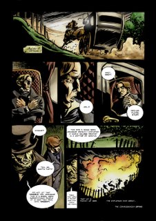
A couple of fairly significant things to post this time (I think so anyway). Firstly, there's page two of the strip that I'm drawing for my friend Niall Doherty. I drew this a little over a year ago and coloured it last night. I think it looks pretty cool (click to enlarge):
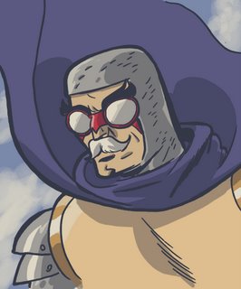
Sky-Knight! Probably my favourite of the Last-Minuters. He wields Excalibur (THE Excalibur mind, not a knock-off or that) and flies a fabulous futuristic biplane called Tempus Fugit. Despite that, and because of a drinking problem and low self-esteem, he is rubbish at what he does.
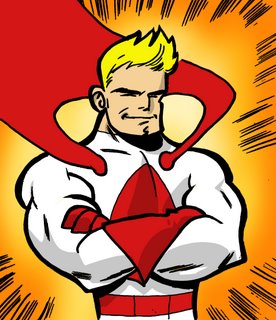
This is Alphaman, the Superman analogue in the TLM-verse. To be honest, I'm probably going to make him a bet less Fleischer and a bit more Owen Wilson. He needs to be attractive to the heroine, and so must be cool heroic, not cheesy heroic. Anyway, I dig this design and the colours. That's an A on his chest.
And there's something else coming quite soon I hope - if Blogger doesn't blow up. Hmmm. Anyway, let me know what you think of the above!

Sky-Knight! Probably my favourite of the Last-Minuters. He wields Excalibur (THE Excalibur mind, not a knock-off or that) and flies a fabulous futuristic biplane called Tempus Fugit. Despite that, and because of a drinking problem and low self-esteem, he is rubbish at what he does.

This is Alphaman, the Superman analogue in the TLM-verse. To be honest, I'm probably going to make him a bet less Fleischer and a bit more Owen Wilson. He needs to be attractive to the heroine, and so must be cool heroic, not cheesy heroic. Anyway, I dig this design and the colours. That's an A on his chest.

And there's something else coming quite soon I hope - if Blogger doesn't blow up. Hmmm. Anyway, let me know what you think of the above!
Friday, June 09, 2006
Sketches!
A couple of slightly older, rougher pieces. Firstly, a sketch of Captain America, possibly running at some damn Hydra terrorist or something. Found this languishing on my hard drive at work, so thought it might be nice to let it get some air. As it were.

Then a little doodle I did at work while I was knocking some god-awful manuscript into shape. It's an ice skater. I really like her slightly cheesy grin and her legs. Nice.

And lastly Wonder Woman. I did for this for a jam on drawingboard.org. I think it looks a little bit like Cat Deeley (inferior British celebrity, for the benefit of our overseas readers).

Feedback welcome as always...

Then a little doodle I did at work while I was knocking some god-awful manuscript into shape. It's an ice skater. I really like her slightly cheesy grin and her legs. Nice.

And lastly Wonder Woman. I did for this for a jam on drawingboard.org. I think it looks a little bit like Cat Deeley (inferior British celebrity, for the benefit of our overseas readers).

Feedback welcome as always...
Tuesday, June 06, 2006
For great taste with nutrition, why not try...
...new DYNAMITO! Now with COLOUR!
I finally coloured this guy. Hopefully this means that The Last Minuters (my nascent comic book about a load of bum superheroes) will now get the much-needed boost it, er... needs. Anyway, look out for more from TLM soon!

And for that wacky eighties manga vibe, here's the same again with a nifty colour halftone effect. Yay Photoshop! (click to see this effect a little better)

What else...? Oh yeah, check this out: these are the character designs for the game Vegas: Make it Big! (the exclamation mark is theirs not mine). This was for a world-building game for Deep Red Games, for which I also designed the scenarios. There are a few fun archetypes in here: the suave British spy, the mad movie mogul, the Penelope Pitstop-esque racing driver, but my favourite is probably the Texas steel baron. He's just a cool looking guy!

Last one: another piece for DR. This was a mood piece for a Hobbit-themed world-building game which - sadly - never got off the ground. Not all of this picture works, and I reckon the colouring is a little ropey, but I'm really pleased with the dragon!

Feedback welcome from one and all!
I finally coloured this guy. Hopefully this means that The Last Minuters (my nascent comic book about a load of bum superheroes) will now get the much-needed boost it, er... needs. Anyway, look out for more from TLM soon!

And for that wacky eighties manga vibe, here's the same again with a nifty colour halftone effect. Yay Photoshop! (click to see this effect a little better)

What else...? Oh yeah, check this out: these are the character designs for the game Vegas: Make it Big! (the exclamation mark is theirs not mine). This was for a world-building game for Deep Red Games, for which I also designed the scenarios. There are a few fun archetypes in here: the suave British spy, the mad movie mogul, the Penelope Pitstop-esque racing driver, but my favourite is probably the Texas steel baron. He's just a cool looking guy!

Last one: another piece for DR. This was a mood piece for a Hobbit-themed world-building game which - sadly - never got off the ground. Not all of this picture works, and I reckon the colouring is a little ropey, but I'm really pleased with the dragon!

Feedback welcome from one and all!
Subscribe to:
Comments (Atom)
